
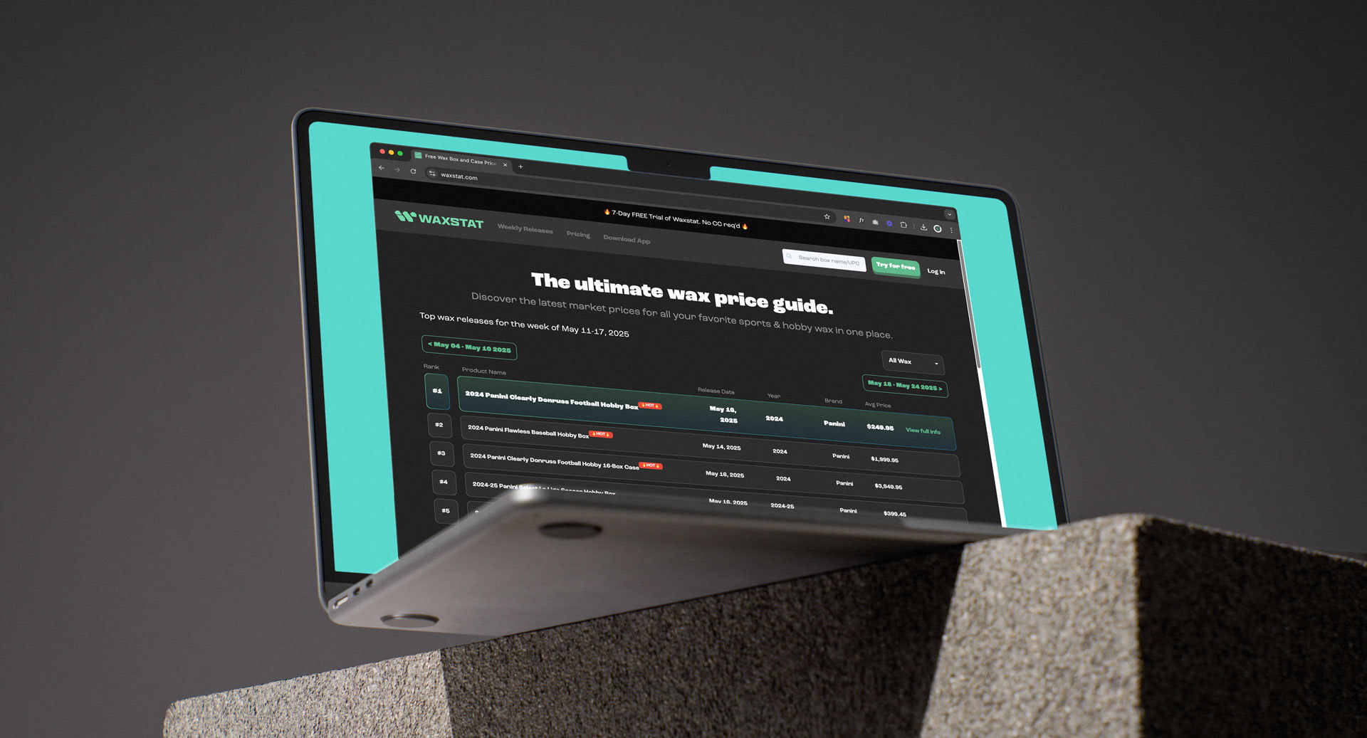
Waxstat Overview
Waxstat was founded by Allan Teruel in 2021 as the easiest way to get real-time pricing on sealed products in the trading card industry such as Hobby Boxes, Cases, Mega Boxes, Blaster Boxes and individual packs from brands like Panini America, Topps, Fanatics, Leaf, Pokemon, Yu-gi-oh!, Magic: The Gathering and many more. Waxstat is focused on making it very easy to answer 3 questions for #TheHobby: What's coming out? How much is it? Where can I buy it?
Headquartered in Las Vegas, Waxstat is created by card collectors to provide pricing transparency for those that buy and sell wax and other sealed trading card products.

Old logo
Goals & Objectives
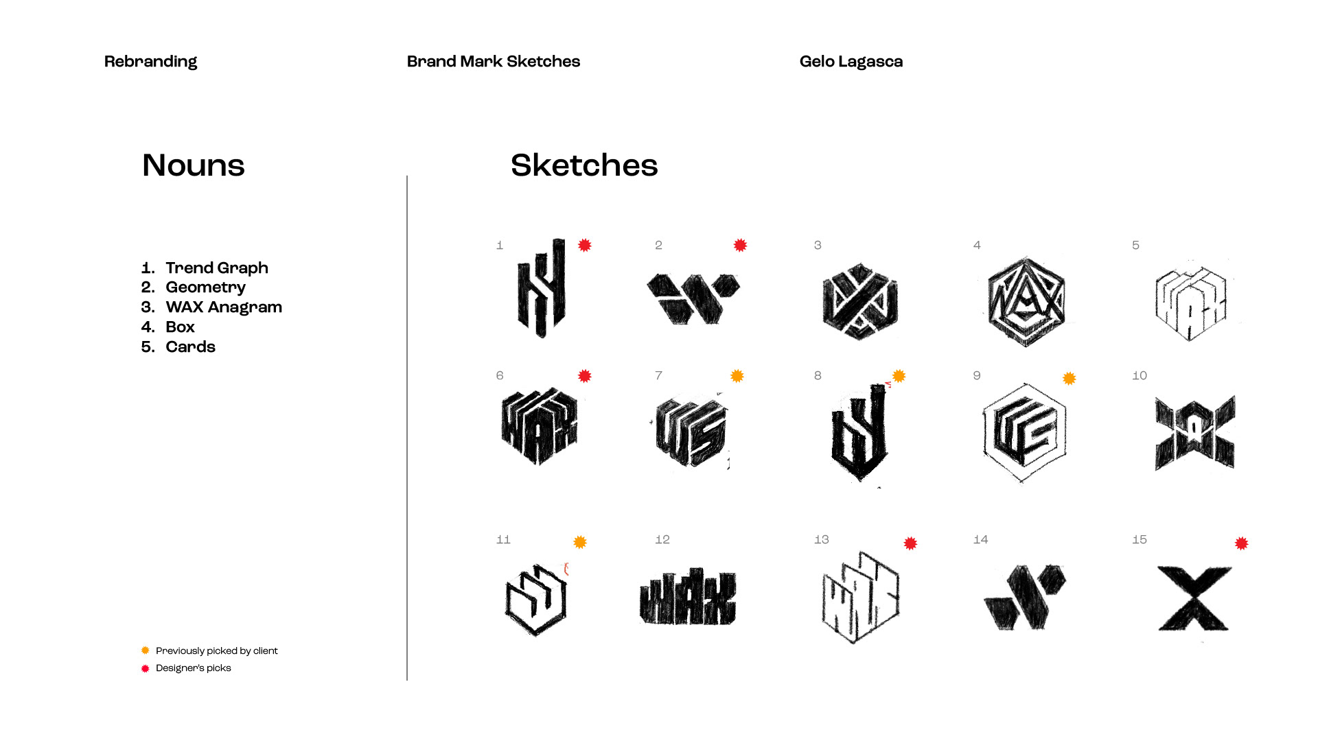
The client sought a logo and branding refresh, feeling their current identity appeared outdated. They hired me to create concepts and define a clear direction, aiming for a logo that’s professional, engaging, and memorable. We began by exploring key words to integrate into their icon design, emphasizing stronger, distinctive typography.
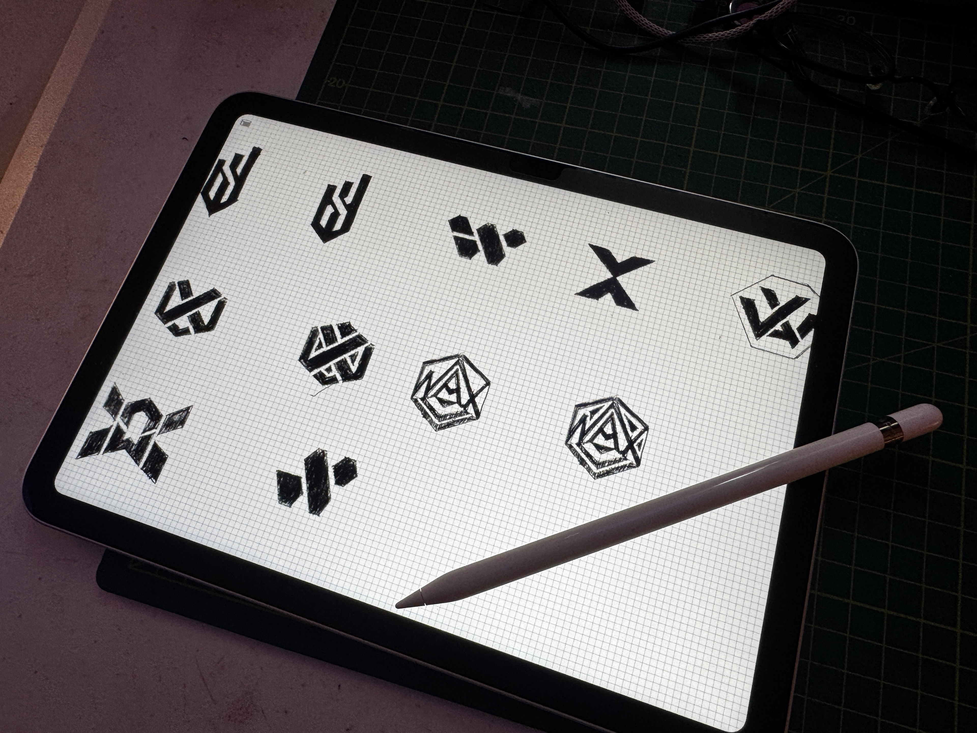
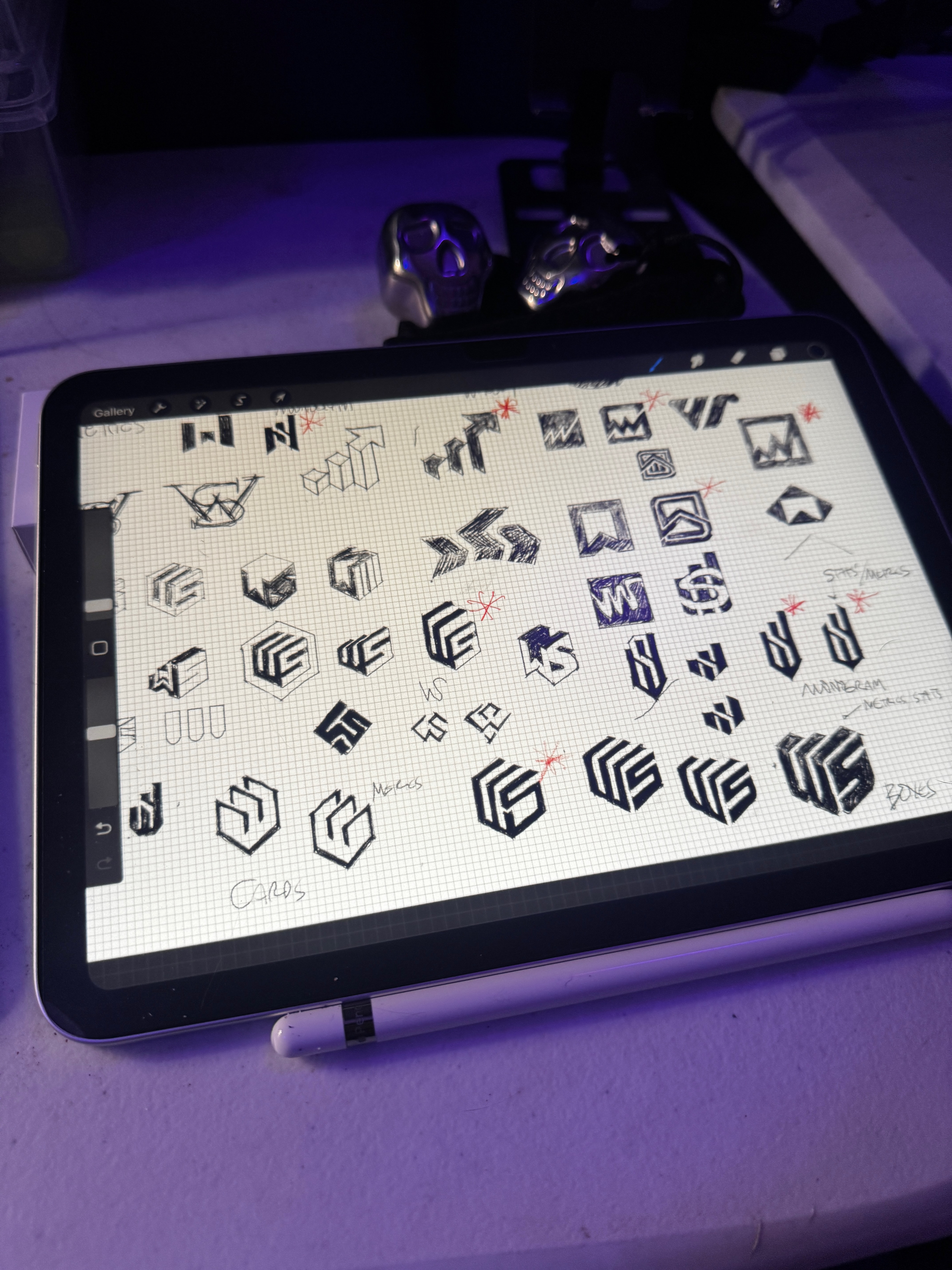
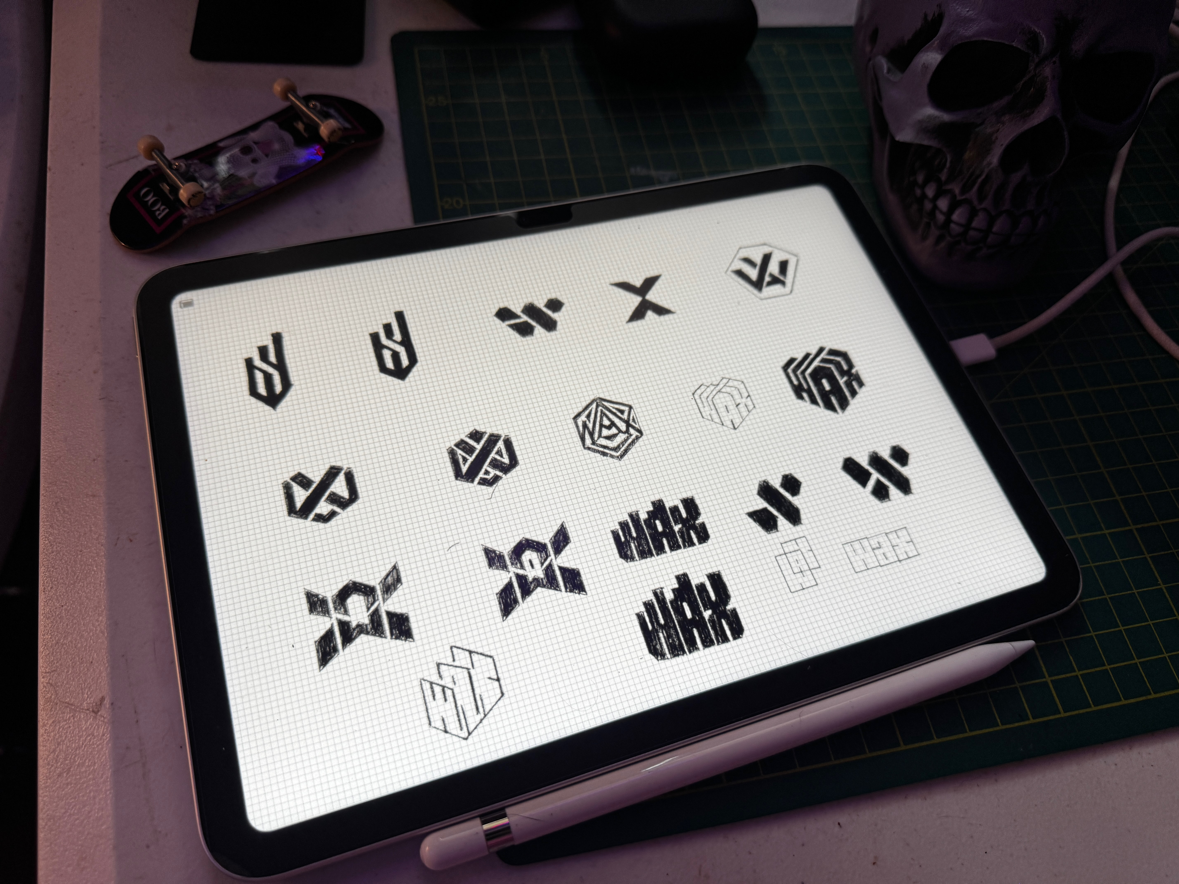
Keywords or Nouns to be considered in the icon:
1. Trend Graph
2. Geometry
3. WAX Anagram
4. Box
5. Cards
Brand Mark Development
The icon concepts were presented to the client as clean, rough-vector samples. I created almost a hundred multiple icon variations designed to complement the lockup typography.


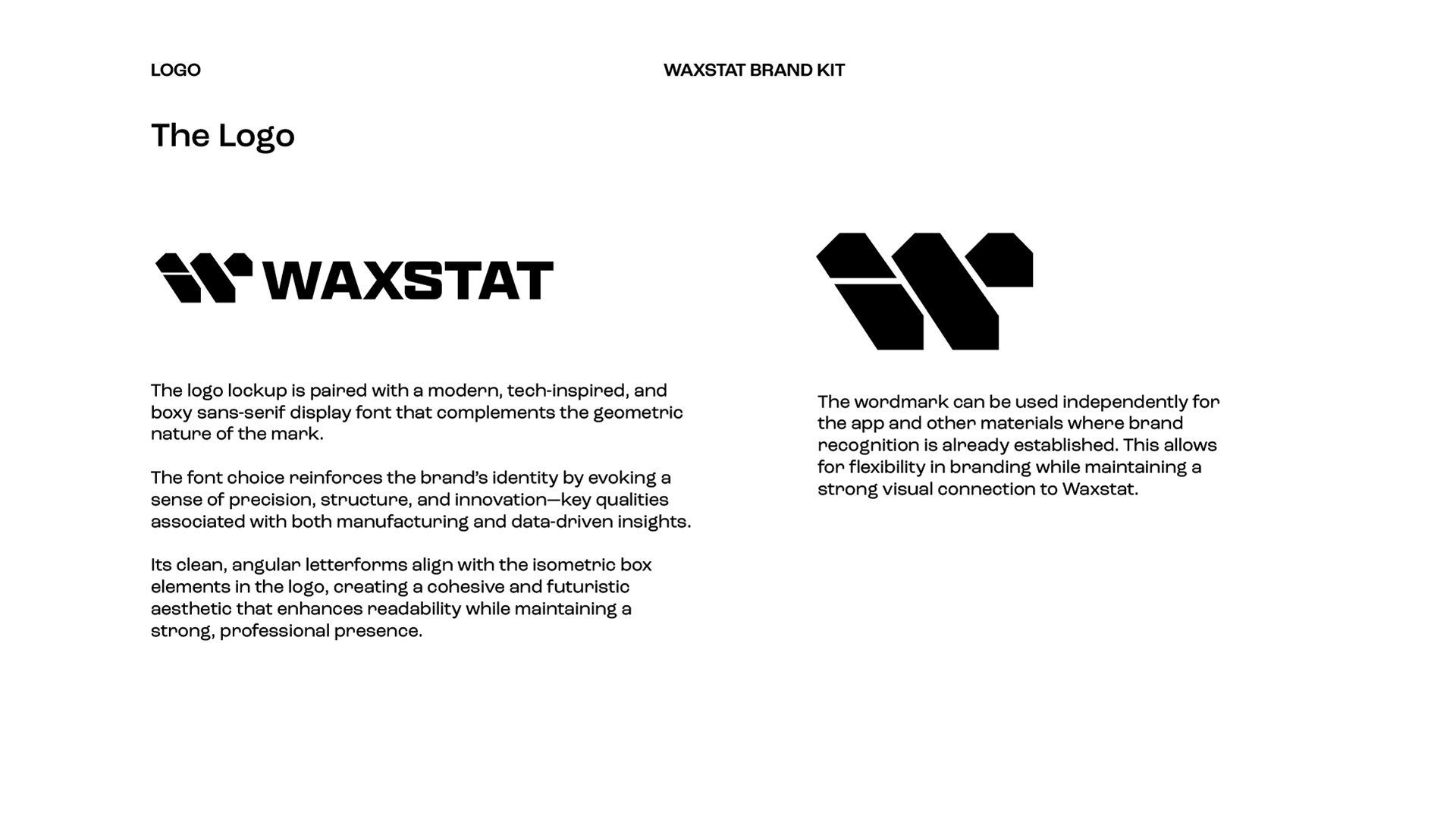
Final Icon
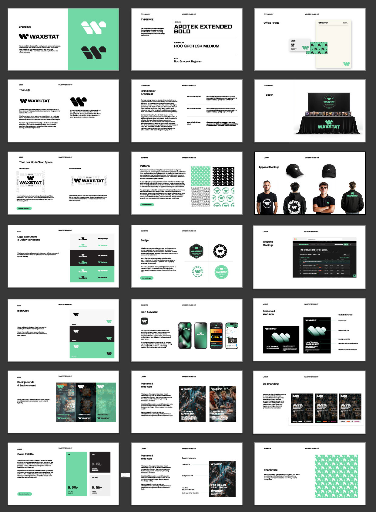
Typeface
The designated fonts are available for installation through an Adobe Creative Suite account, ensuring seamless integration across design applications.
HEIRARCHY & WEIGHT
The logo lockup features Apotek Extended Bold as its typeface, chosen for its bold, blocky, and tech-inspired aesthetic. Its extended letterforms and geometric structure create a strong visual presence that aligns seamlessly with the isometric box elements in the icon. This typeface reinforces the brand’s modern and industrial feel, enhancing both readability and impact while maintaining a cohesive, forward-thinking identity. Complementing this, Roc Grotesk is used as the supporting sans-serif font. Clean and highly flexible, it shares characteristics with classic Swiss typography, offering clarity and versatility across various applications. Its refined yet neutral design ensures seamless integration into the brand’s visual system. Roc Grotesk is particularly well-suited for subtitles and body text, providing excellent readability while maintaining a contemporary, professional look that balances the boldness of the primary typeface.
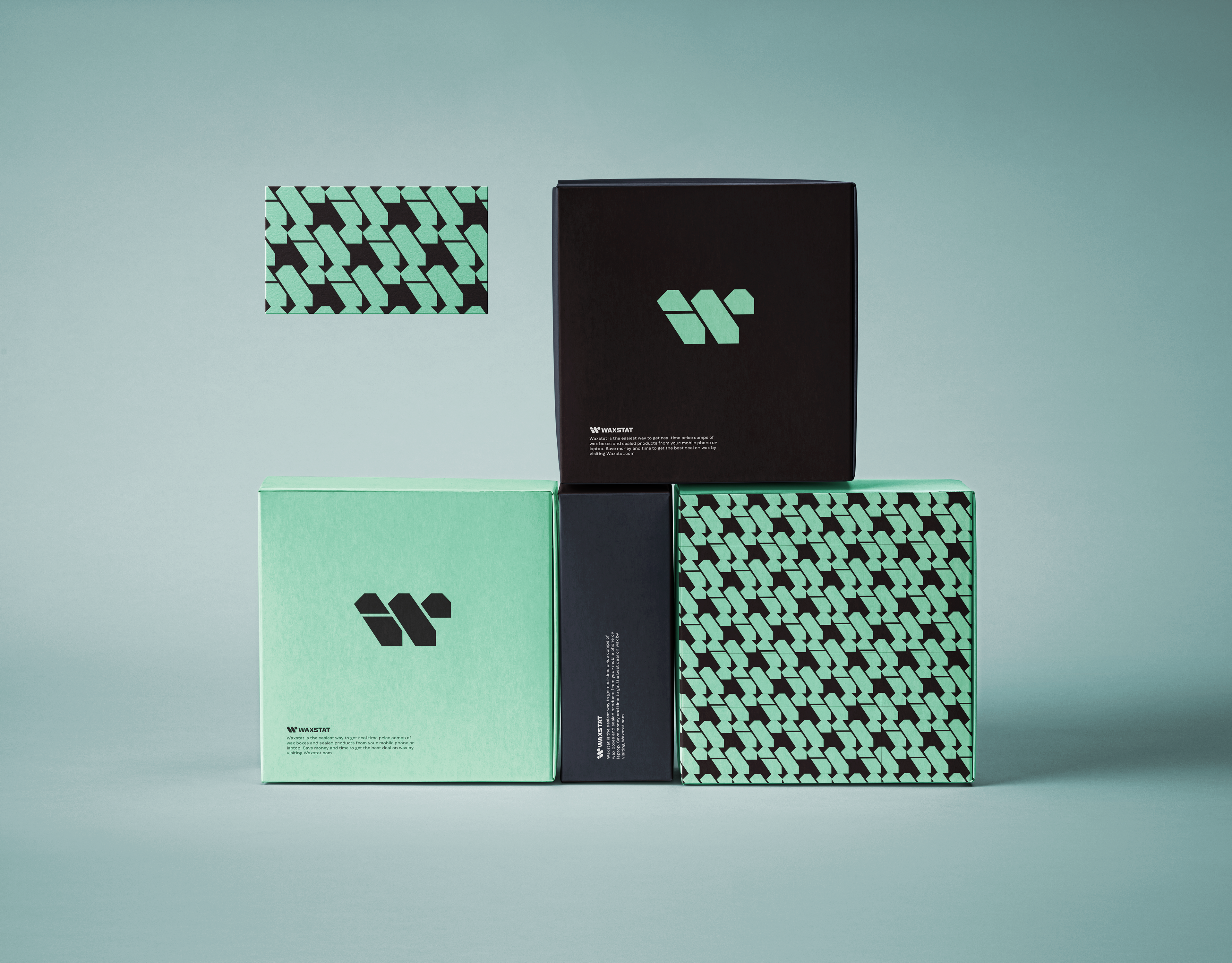
Color Palette & Patterns
The primary color palette consists of teal, ash white, and onyx, creating a sleek and modern aesthetic. Teal adds a sense of innovation and trust, while ash white provides a clean, minimal backdrop that enhances readability and contrast. Onyx introduces depth and sophistication, grounding the design with a bold yet understated presence. This refined color combination keeps the visual identity simple yet striking, ensuring versatility across both digital and print applications.
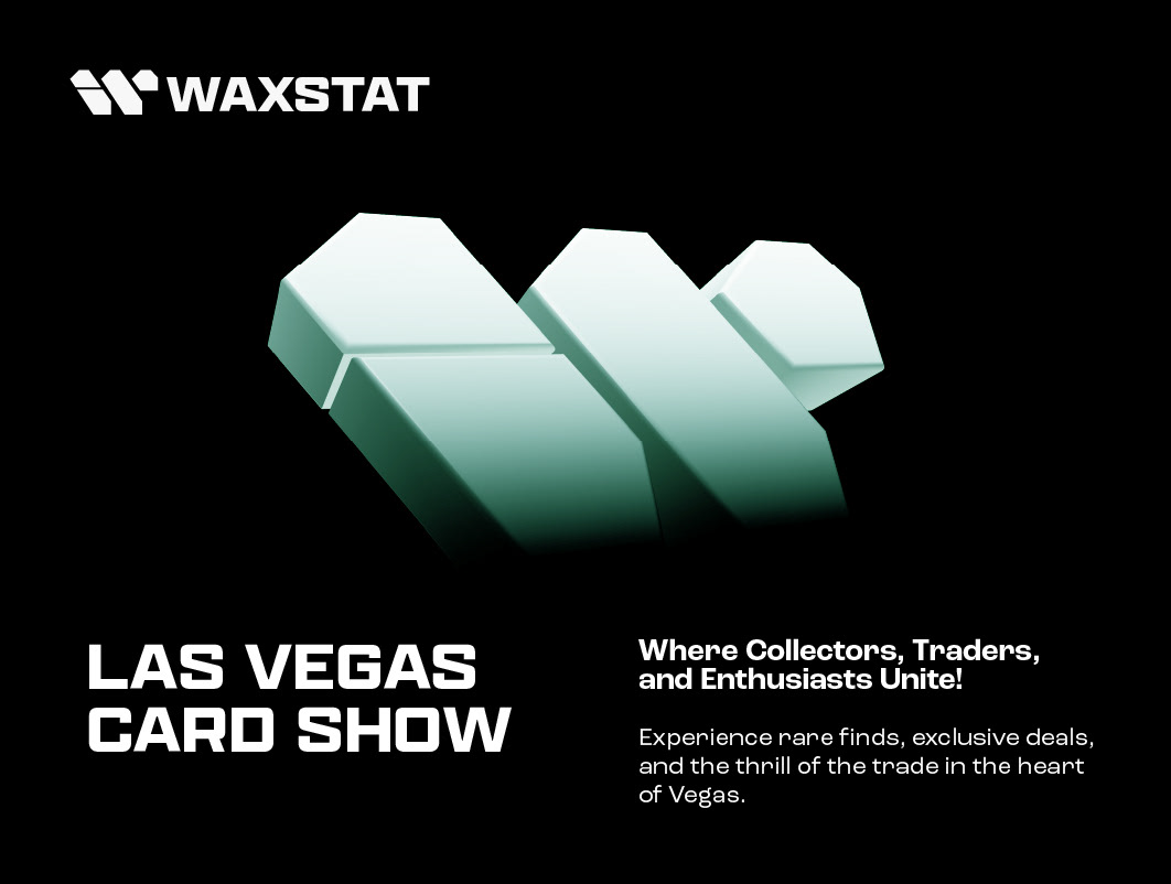
The Lockup
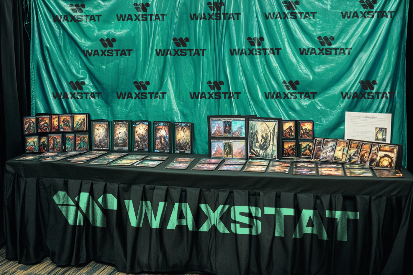
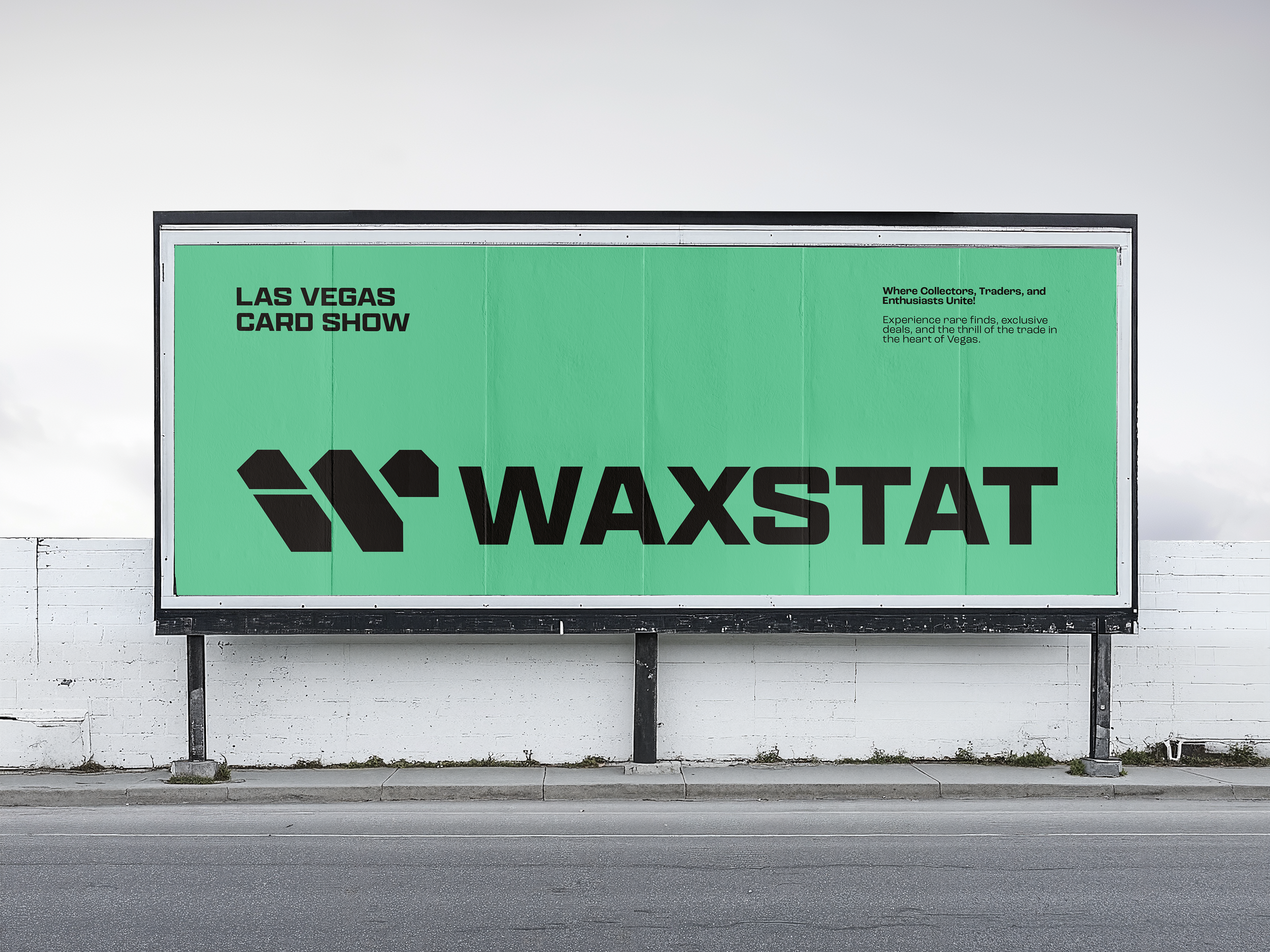

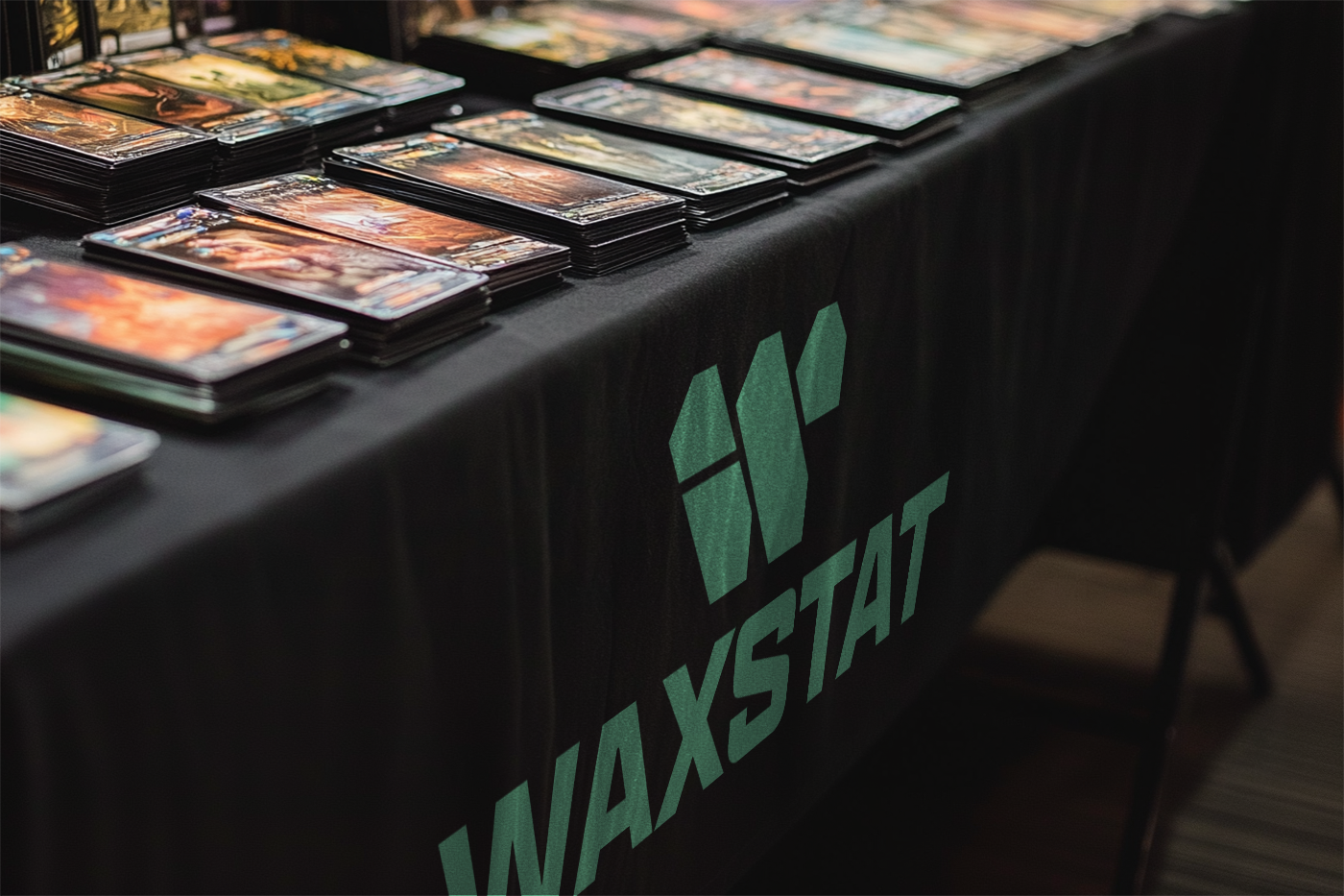


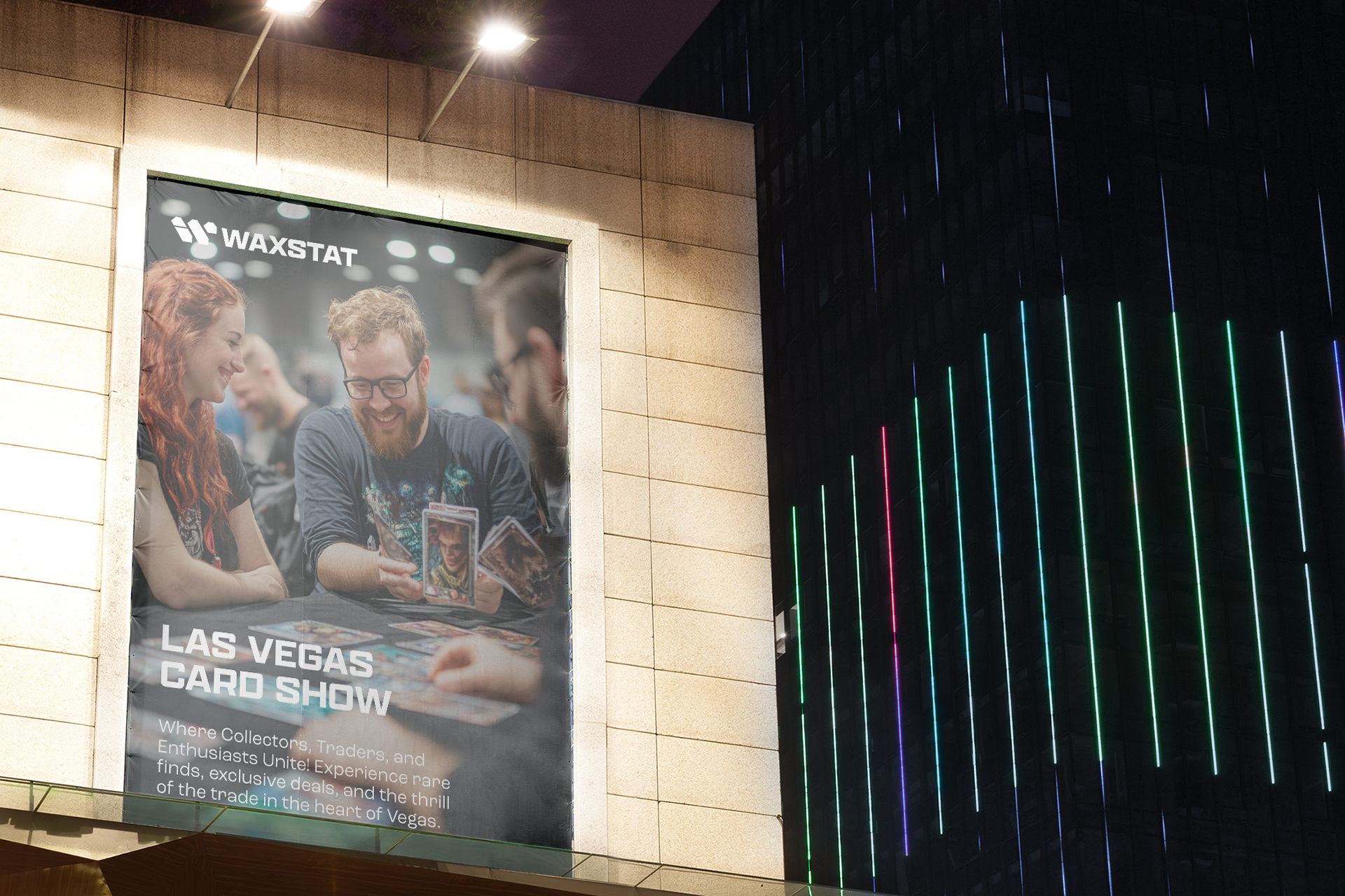
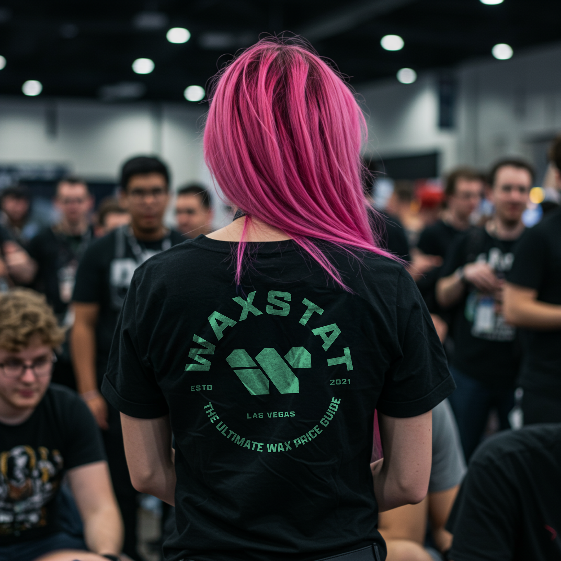
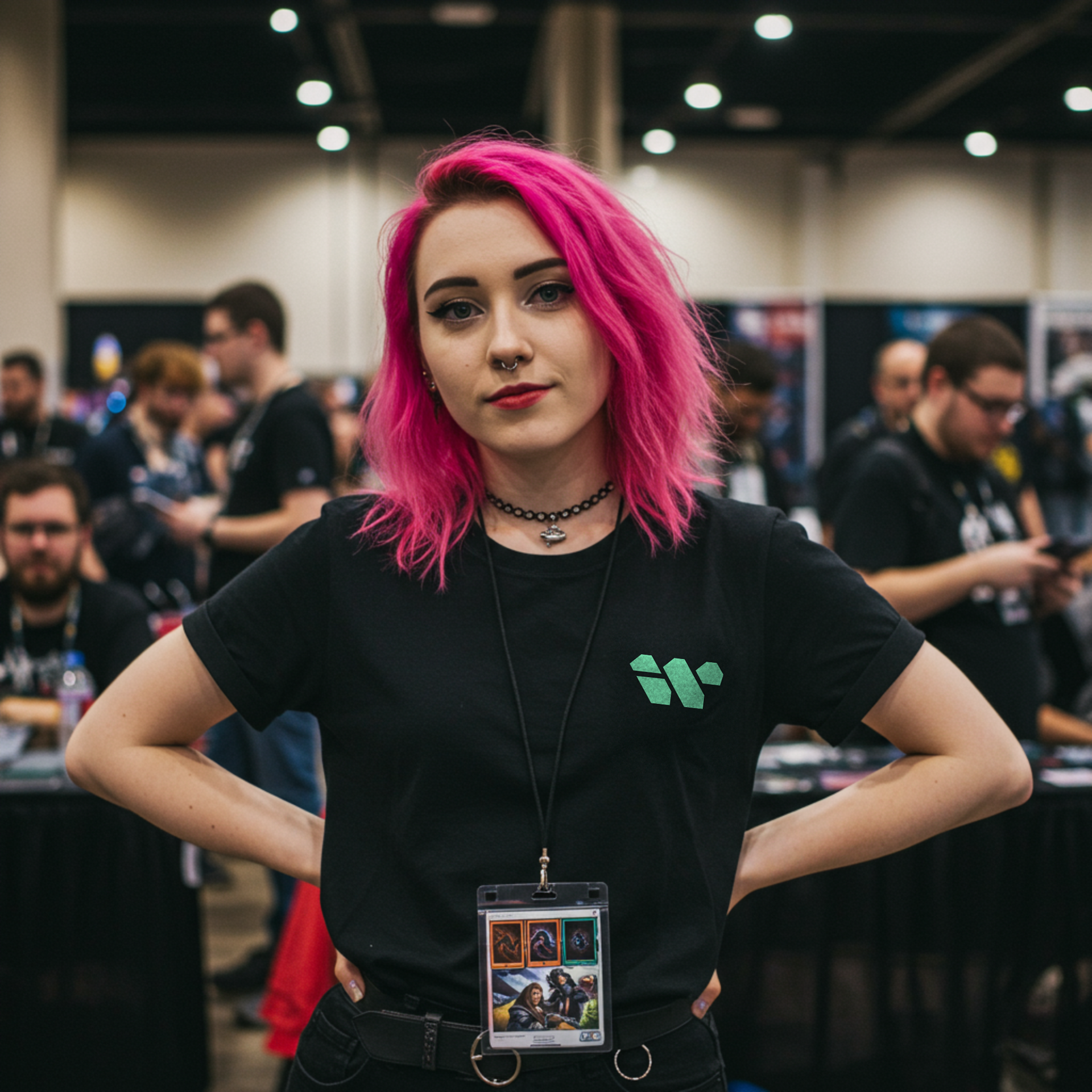
Merch


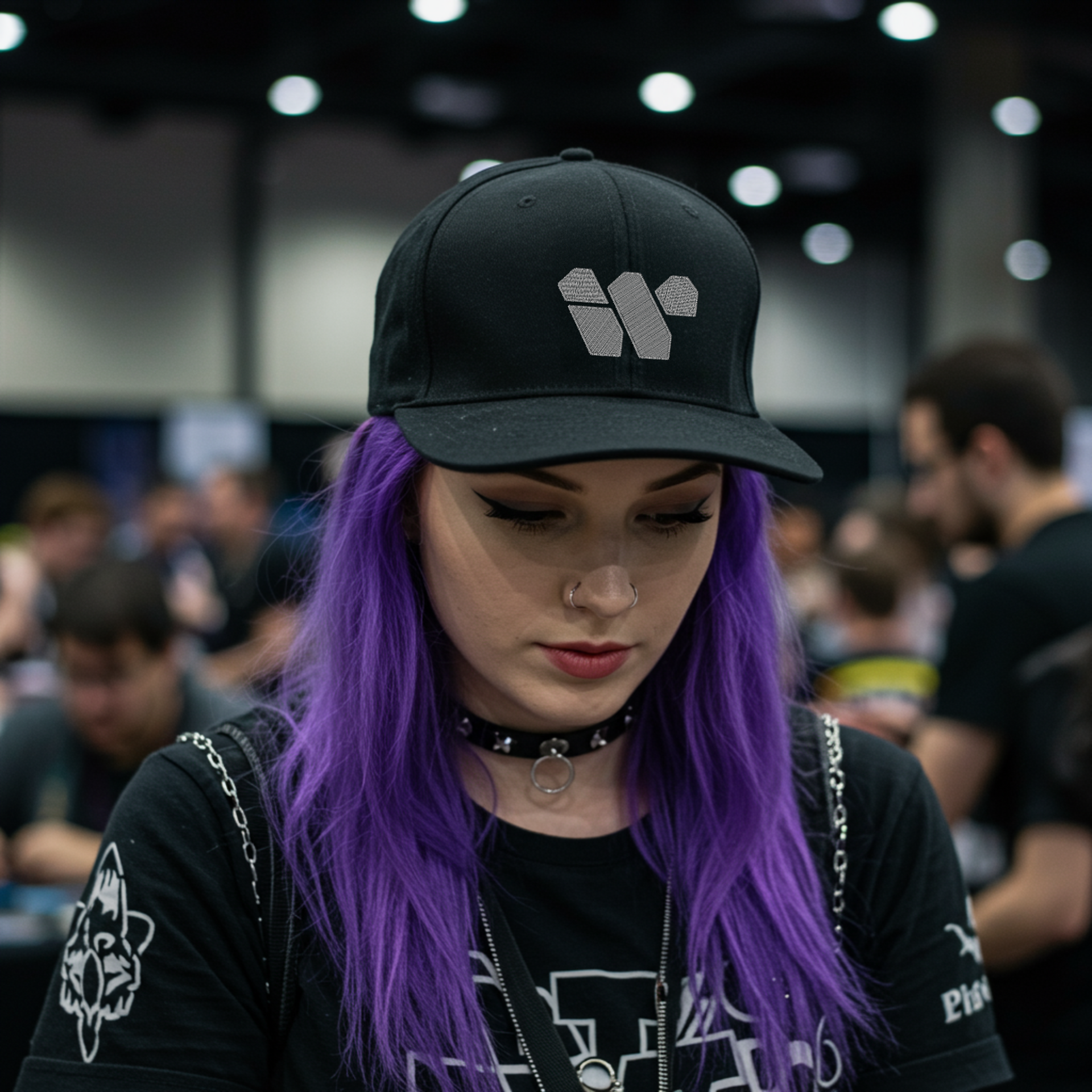
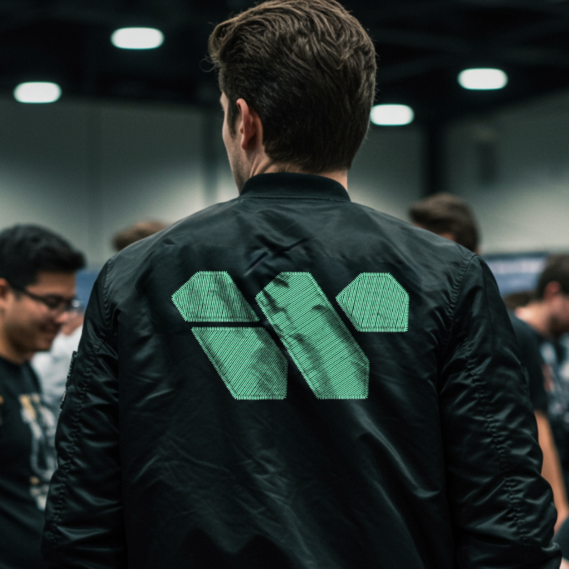
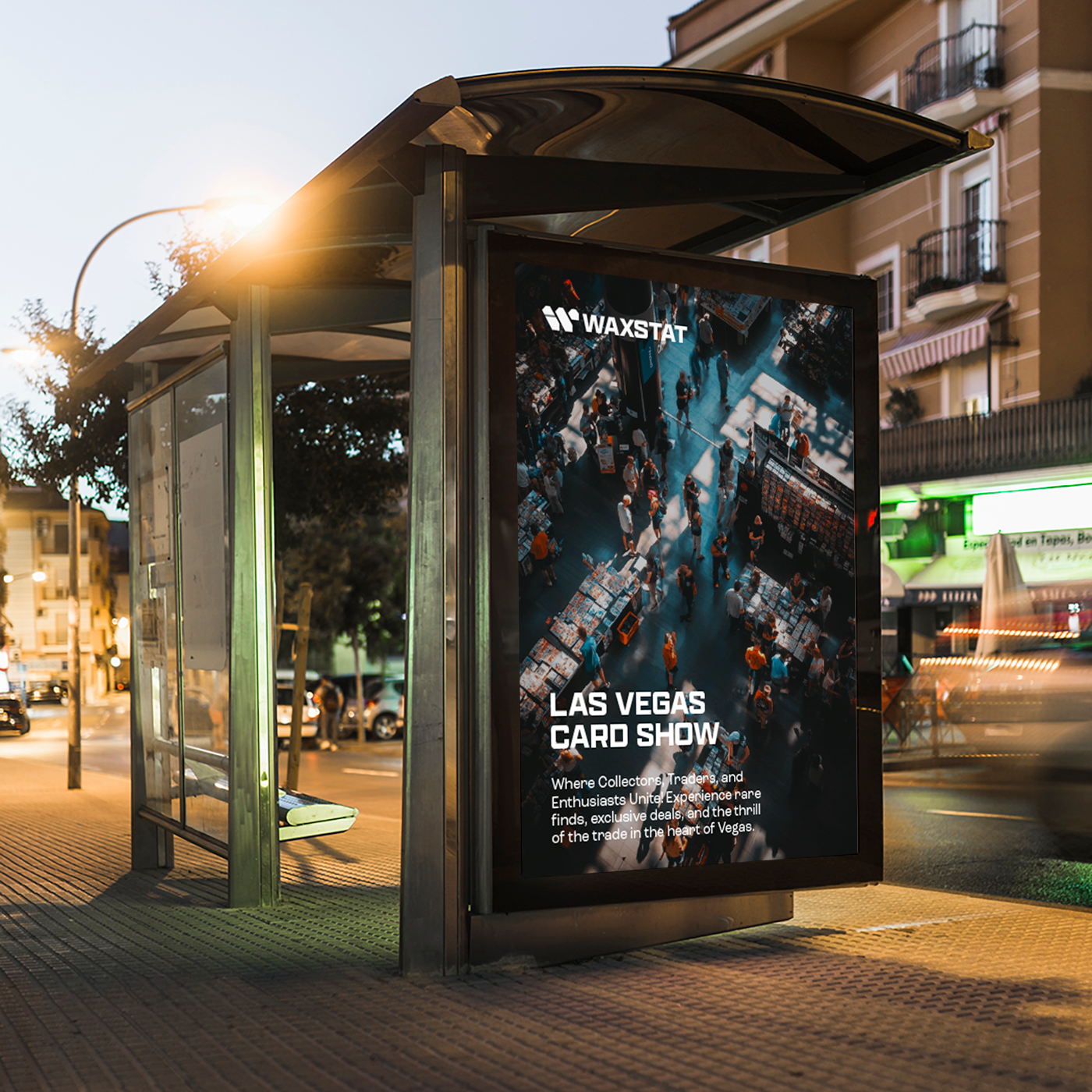

The Brand Kit
Results & Impact
The rebranding project was a success, anchored on mutual trust and a clear process. This was the client’s first time undergoing a full rebrand, and they trusted me based on my previous work in brand redesigns. From the start, we aligned on milestones and expectations, making the process smooth and focused. Our short but consistent weekly check-ins ensured we stayed on track and made room for feedback. The project was truly collaborative—built on transparency, creativity, and shared vision.
Take Aways
I learned that presenting designs simple and clearly makes a big difference. Clients appreciate the effort more when they understand the “why.” Also, taking my time and not rushing the process led to much better results. Patience really pays off in design.