The Brief
Not just a
beauty brand.
An institution.
beauty brand.
An institution.
Makeup Science Asia had a problem most beauty brands would envy — they weren't just selling products, they were teaching people how to formulate them. They ran workshops, trained professionals, and built a following rooted in education and expertise. But their logo didn't say any of that.
The existing identity read as just another beauty brand in a saturated market. MSA needed a mark that positioned them as an authority, something that felt credible, academic, and trustworthy at first glance, without abandoning the warmth and artistry that defines the beauty industry.
The challenge: create a visual identity where science and art don't compete, they coexist. A mark that earns trust the way a university crest does, while staying expressive and human.
| "Create a visual identity where science and art don't compete, they coexist."
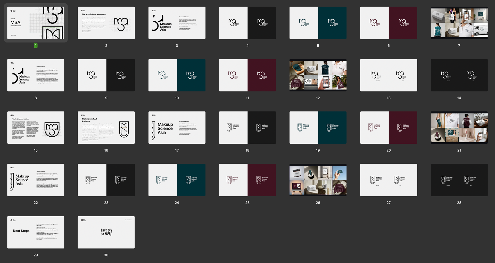
Ideation
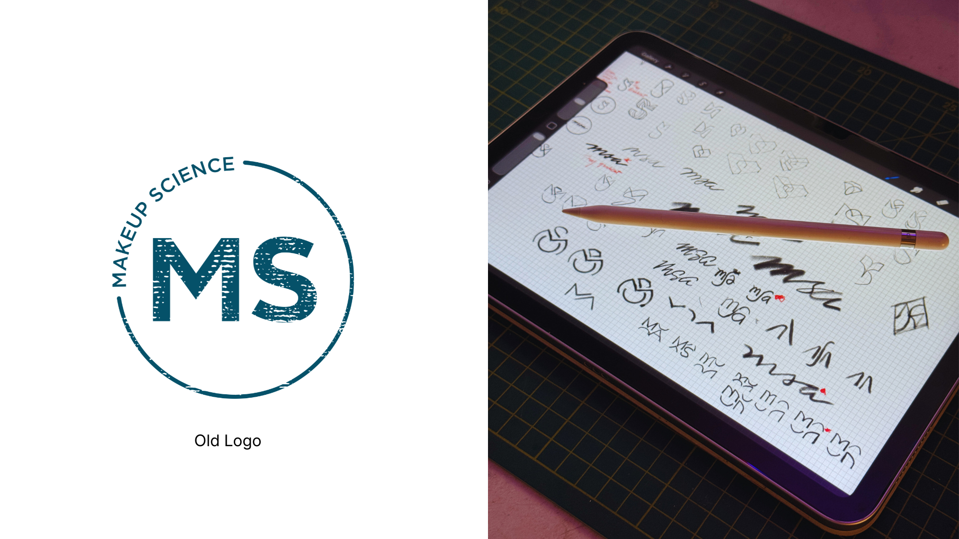
Starting with the pencil
Every logo starts as a loose idea. Before touching Adobe Illustrator, the exploration begins on the iPad, fast, uncommitted, and free to be wrong.
Exploration
Dozens of directions,
one destination
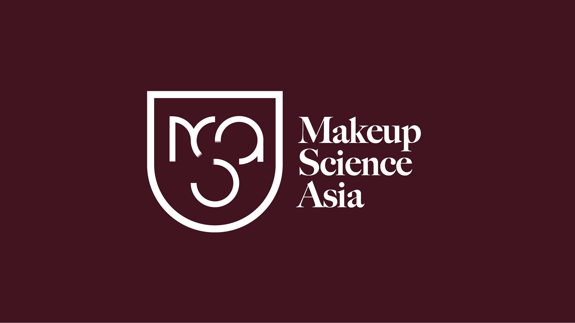
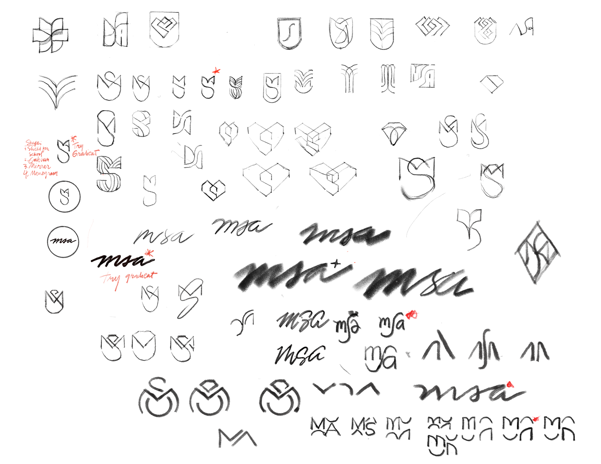
The sketch sheet shows the breadth of the exploration, shield forms, monograms, calligraphic approaches, geometric constructions, and stacked letterform experiments. Hundreds of variations narrowed to a single direction: the M–S–A monogram built on the law of closure.
The law of closure means the eye completes the form even when it isn't fully drawn. Open forms that the brain finishes, reflecting intelligence, intention, and modern thinking.
The Shield
The monogram alone was strong. But subtly enclosing it within a shield-like silhouette elevated it into something else entirely, an emblem. The shield gave the mark institutional presence. It suggests standards, certification, protection, and trust.
"Not just a brand, but a body of knowledge."
The thick monoline style feels clinical and intentional, while the subtle brush texture at the tips adds the human, artistic side. The shield is the science. The brush strokes are the art. That balance is the entire brand.
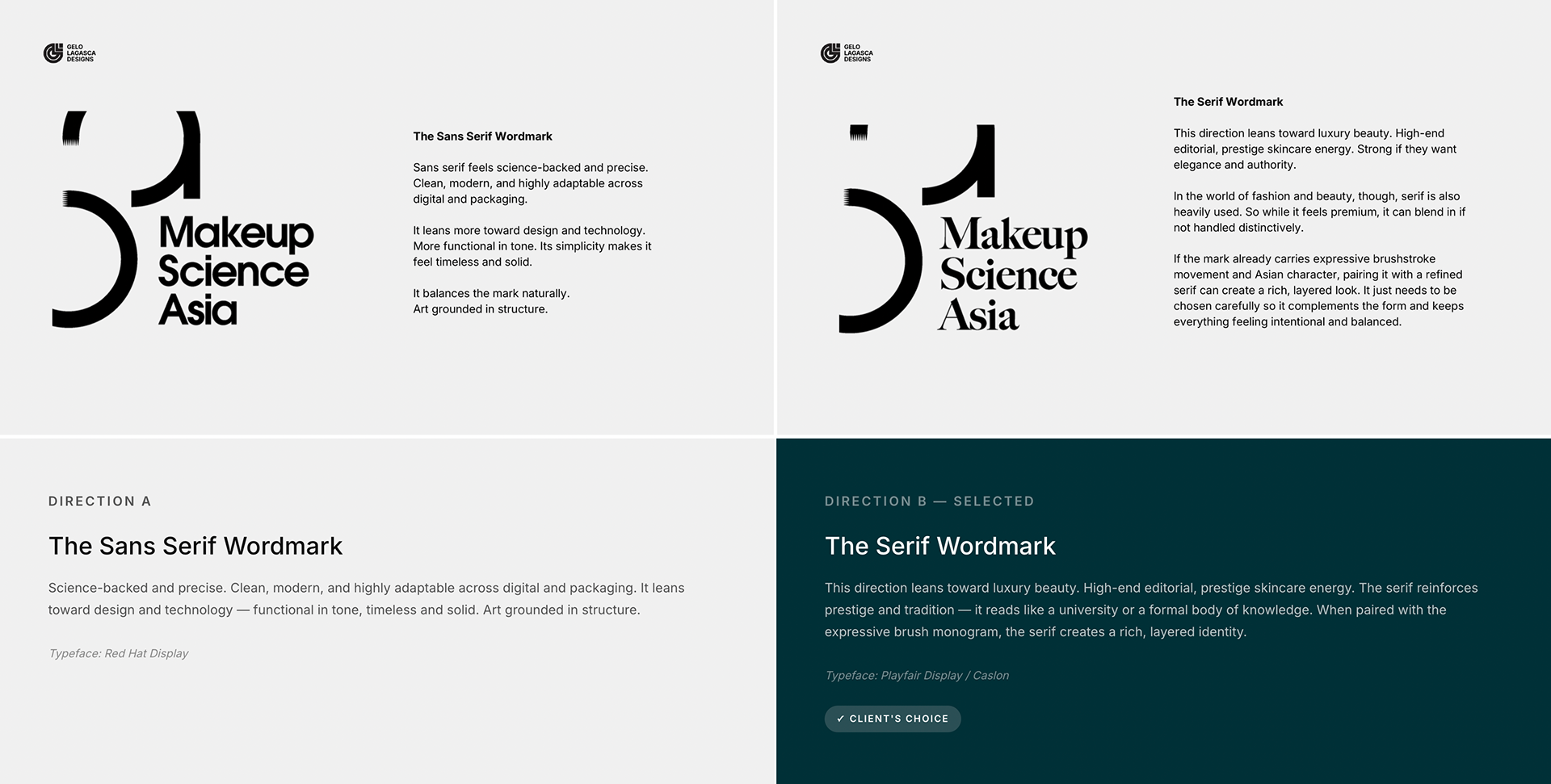
Typography Direction
Two voices,
one decision
The monogram was locked. The question became: what voice does the wordmark carry? Two directions were presented to the client, each telling a different side of the MSA story.
The Final Mark
The Shield
& the Serif
This lockup feels academic, structured, and premium. The shield gives it authority and makes it read like an institution, not a beauty brand. It signals standards, certification, and trust.
The monogram is clean and precise. The thick monoline style feels clinical and intentional, while the subtle brush texture at the tips adds the human, artistic side.
The serif typography reinforces prestige and tradition. It reads like a university or formal body of knowledge. Overall, it positions MSA as an authority in its field, strong, credible, and institutional.
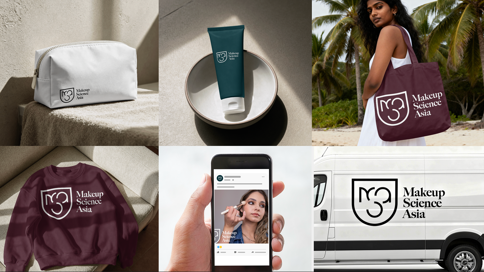
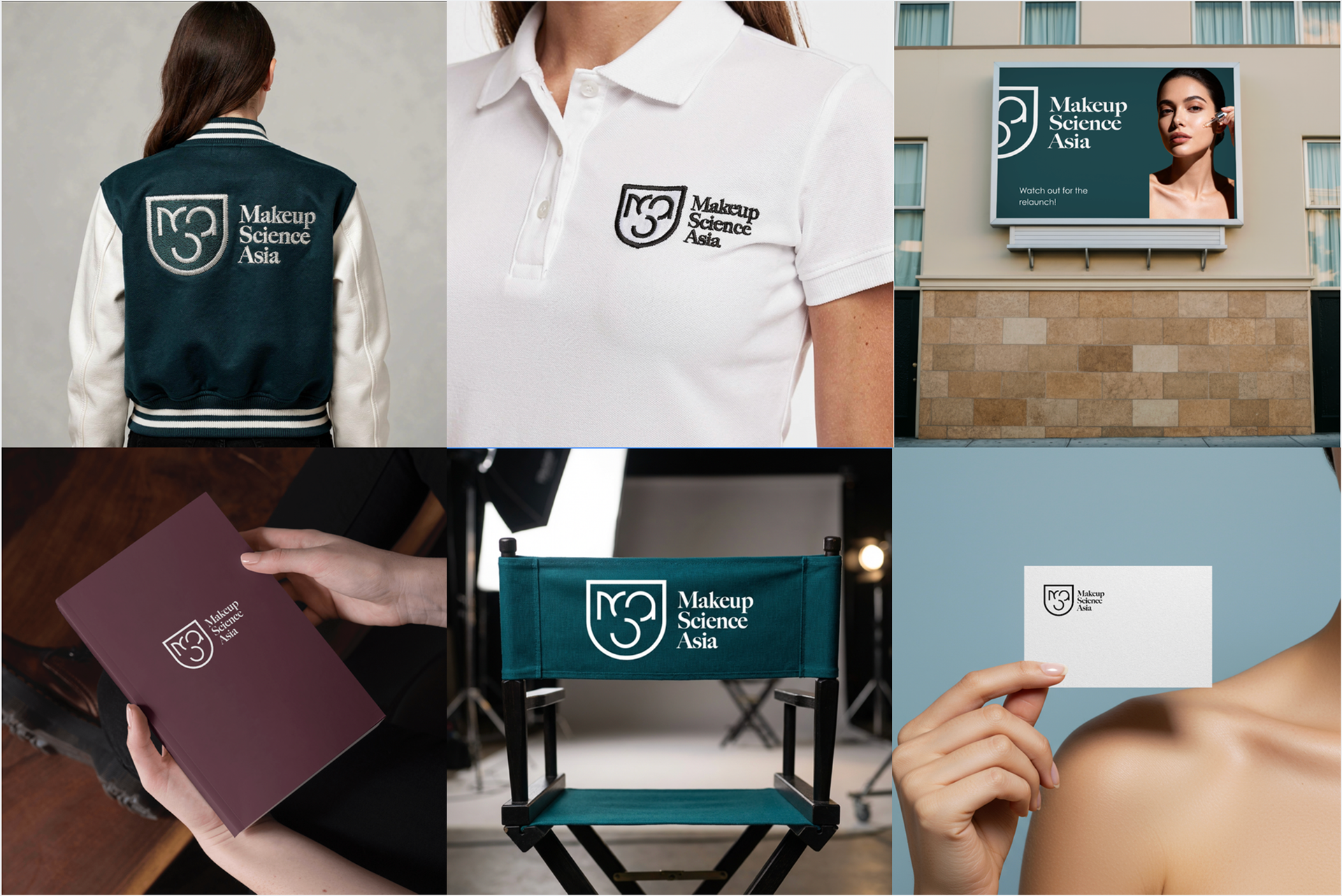
Brand in Use
The mark in
the wild
The logo system was tested across product packaging, apparel, digital, signage, and print. A brand lives in context, and this one holds its own in all of them.
Reflection
What this project
taught me
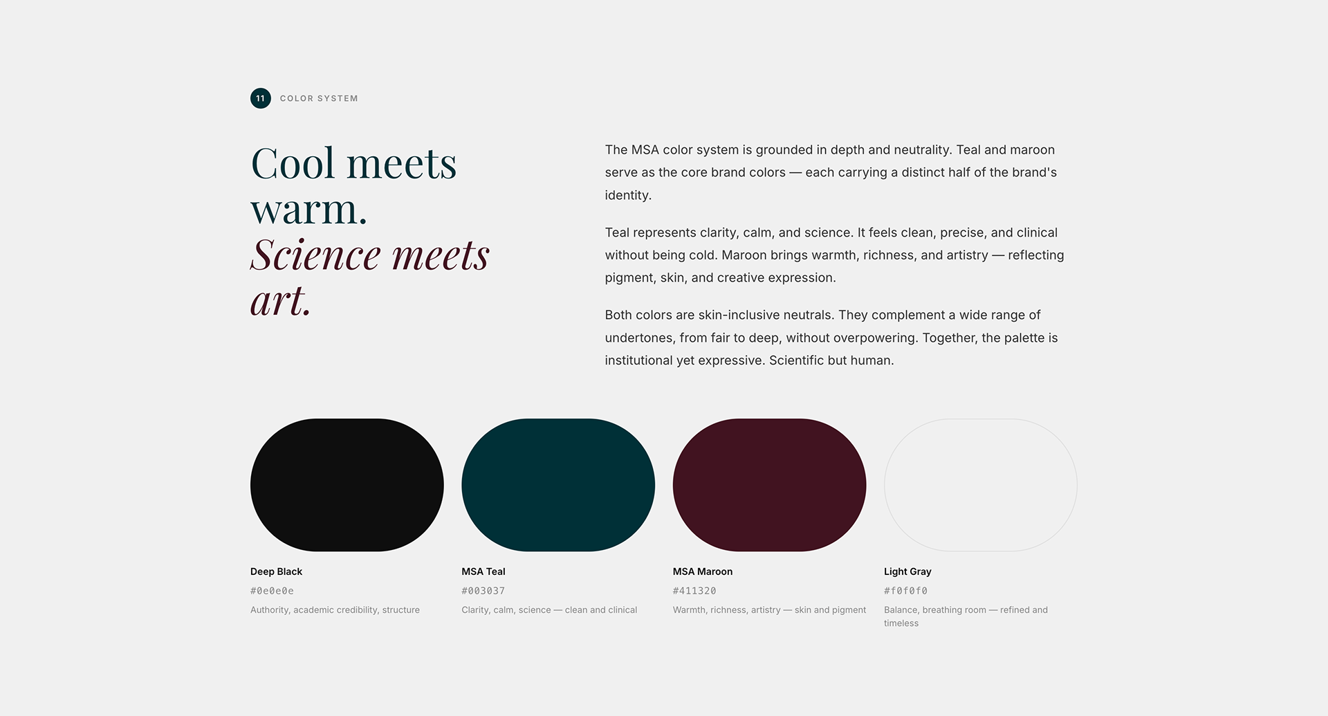
The MSA redesign reinforced something I keep coming back to, the best logos don't just look good, they make an argument. Every decision in this mark is a statement: the open monogram says we trust the viewer's intelligence; the shield says we take our craft seriously; the serif says we have history and depth; the maroon says we're still human.
The tension between the geometric structure and the brush texture was the hardest thing to balance, and the most important. Too much structure and the brand becomes cold. Too much expressiveness and it loses authority. Finding that edge is the job.
MSA deserved an identity that made people stop and ask, "What is that?" then immediately feel the answer. I think we got there.
And beyond the aesthetics, I hope this identity does what good branding is ultimately built to do, open doors, build trust, and bring more students and opportunities to MSA.
And beyond the aesthetics, I hope this identity does what good branding is ultimately built to do, open doors, build trust, and bring more students and opportunities to MSA.